The images below show the progression and development of my learning when UV Mapping a 3D scene. I have never UV Mapped before so this method is still quite basic. I have used a couple of online tutorials from digital tutors in order acquire a better understanding of the way UV Mapping works. This scene consists of a vinyl record player which will feature as one of the first establishing close up shots of my animation short.
UV Mapping is necessary as it is a method of creating a map for the textures, so that they can behave correctly on a 3D model.
 The image above looks a lot better. The light levels seem more in keeping with the lighting of the apartment interior. I believe the desired mood of the shot has been achieved here.
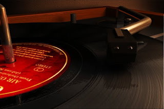
 Above is a finished composite. It is clear in this image that the textures are no longer stretched and look is believable and effective. I am very pleased with this. It looks realistic and the detail of the textures are clearly visible. I have applied a bump map to enhance the textures so that the details react to the light in the scene. This scene however may be a little too overexposed. This image may need to be darkened which I believe can be achieved using compositing techniques such as using multiply and overlay layers and altering the brightness and contrast.The addition of the incandescent plane really enhances the record grooves by interacting with the bump map. This is a composite both of the same scene with and without the incandescent plane, so that it was easier to remove the unwanted reflections. I then overlaid an occlusion pass over the top to introduce more depth to the image.
 Here I have decreased the value of the bump intensity from 1.000 to 0.091. This looks much better. The grooves have been toned down and softened so they are a little more subtle. I do think however that an incandescent plane may help to enhance the bump.
The image above demonstrates how I was experimenting with the bump map. The bump map here has produced very deep chasms. The bump intensity was set to default. I shall have to decrease the amount because the detail here is far too pronounced, undesirably and distracting.

With smooth preview switched on this really does look great. I am very pleased with this. The mia material is providing a very nice chrome texture. I am not entirely sure about the incandescent plane however. It seems to be overexposing the shot and the bright reflection on the chrome arm and needle head is not something I want. I may have to render the same shot with and without the incandescent plane serving as the reflection so that using adobe after effects I can merge the footage together and deleting the area I do not want illuminated.
 In this image I applied a mia_material with its presets set to chrome and a blend of 75%. I have seen that these mia textures/ shaders can be really useful and look very effective. The mia material has already enhanced the image here due to its realistic and believable reflections. At the moment the scene has not been switched to smooth preview. Smooth preview can be applied by enabling mental ray and then going to window> rendering editors>mental ray>approximation editor>subdivision>assign.
Above is where I used a highly reflective blinn for all the metallic components. As you can see this material was not suitable. It is too flat and the texture is too uniform.
 Above is the bump map which will be applied to the texture below. I learnt that that decreasing saturation so that you end up with a black and white image works best with bump maps. I adjusted the contrast by increasing it even more so that the wood grain is more defined so that the texture will react to the light in the scene. The wood grain should produce some nice highlights to an otherwise flat texture. Bump Maps provide depth to a texture.
 Above is a high resolution 1024 x 1024 texture I created using different wood texture images and merging them together using Photoshop. I sharpened the image and increased the contrast slightly so that the texture is enhanced thus giving more definition to the wood grain and the texture as a whole.
 The image above shows the model and lighting setup. I made sure that anything behind the camera was not UVed as there is little point. Any parts of the model which was not visible within the resolution gate I deleted in order to decrease render time.
 Once the basic method is complete I then planar mapped the record model so that I could project a record texture onto the faces that are facing upward.
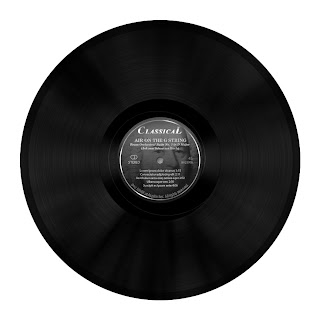 Above is the vinyl record bump map. The contrast has been increased here so that the overall detail is slightly enhanced so that the bump map itself will have more definition.
Above is the vinyl record texture. This was a texture I made using various photographs of vinyl records on the internet.

Above is the UV editor which I used to complete the UV mapping process so that the textures look even better. This graph shows the layout of the UVs. This graph can be used to edit the size and look of the applied textures. The UV's must be edited within the top right of the graph.
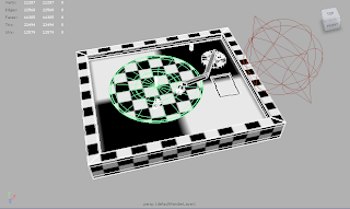
I have applied a checkered texture to all the components as a temporary test in order to locate any texture stretches. In this image I had to make sure that the checkered texture was not stretched by using the scale tool in the UV editor so that the checkered pattern formed perfect squares. By this useful technique I can use this temporary texture as an indication to show me where the texture is stretching.

The render above is a low resolution test which demonstrates how the textures are behaving when the model is rendered.
 The image above shows how I have applied a wood texture to the vinyl record player frame as well as a texture to the record model itself. This texture stretching is the result of not UV Mapping the model so the computer does not yet understand how I wish the textures to behave upon the surfaces.
 Above is the vinyl record player with smooth preview turned on. This setting can be useful when rendering as it decreases render time due to the fact that it smoothes models using less polygons, edges and vertices.
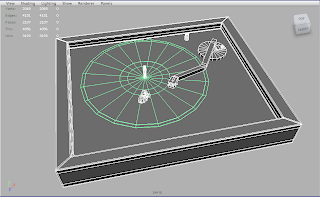
Above is an image of the low resolution vinyl record player model.


 The image above is a shot I had in mind in order to strengthen Frank and Rachel's relationship for the viewer's benefit. It depicts Frank and Rachel on a holiday together.
 This image is a shot idea I had suggesting that Frank was not always a hit-man, and that he was once during his younger years a successful boxer before gambling and drink found him.
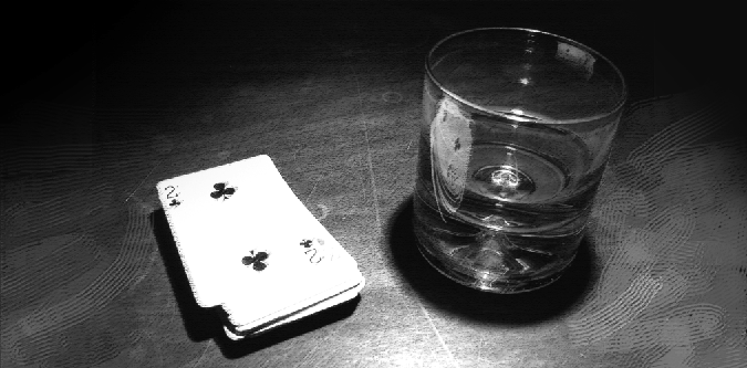


 Above is a test render of the apartment room interior, so the settings were generally low. Thus the quality is not as good as it could be. All of the crucial furnishings are in place with simple blinn shaders applied to them. I wanted to get a rough idea of what the apartment interior would look like with colour textures and lighting. This test was a pleasant surprise. Although it is by no means perfect it provides me with a good idea of what the final result may look like. This render also gave me confidence that if done well the final result should look impressive. An occlusion pass I believe will make this render look even better because it will add depth and surface shadows to the surfaces within the apartment.


