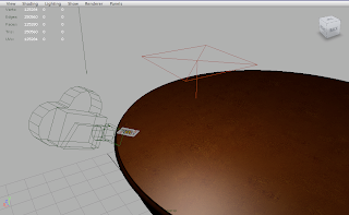
A very simple scene setup with a standard area light. The colour light output was adjusted to a a warm cream colour. I then changed the light shape in the mental ray tab of the light attribute to a sphere so that I could get the light quality closer to that of a bulb. A regular area light gives a very harsh edge to the shadow whereas I wanted some realistic and softer drop-off. I also switched the area light from no decay to linear. Digital Tutors taught me that when a default light in Maya is created its light output behaves unrealistically as it emits light and its rays strength do not dissipate with distance. However once switched to linear you can achieve some great lighting effects as its strength wanes depending on how far away you place the light from the subject within the scene. With these settings it is possible to light something effectively with put adding more lights to the scene which is unnecessary and impractical as a scene becomes messy and harder to manage. Adding numerous lights can cause scenes to become overexposed and over-lit. Having fewer lights in a scene also reduces render time as Maya does not need to calculate so many rays of light and how they react with the surfaces/ faces/ normals of the geometry within the scene.
To begin with the scene was too overexposed as I had set the intensity far too high to a value of 8.000, I forgot to take into account that the light placement was relatively close to the tabletop geometry so I reduced its value to 4.000. The result was very much improved and the colour of the textures were perfect. Not too bright and not too dark. I then deleted all the components within the scene that were no in shot so as to reduce render time. Having geometry outside the frame is unnecessary and reducing memory never hurts.

Here I adjusted the brightness and contrast by increasing the contrast.


No comments:
Post a Comment