For starters I shall setup the scene properly by importing all the models into the scene, texturing the non glass and liquid materials and lighting the scene.
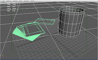 Above is the basic model setup and layout.
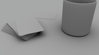 An occlusion of the scene to detect any problems with surface interactions.
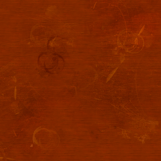 Initially the texture when rendered had very noticeable seams which were very distracting. In order to solve this problem I had to firstly make the texture larger. I also needed to use the clone stamp tool in photoshop in order to create new areas of detail using existing areas of detail. By doing this I would be removing unwanted seams in the texture that are otherwise hard to see.
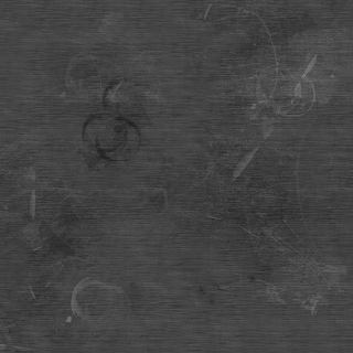 I then began creating and preparing a quick tabletop texture in Maya as the previous textures I felt were awful, dull and plain. I took Dan's suggestion and created a more detailed texture complete with scratches and stains in order to suggest wear and tear. I then turned the sturation to a value of 0 in order to create the bump map which will serve as a means of adding illusionary depth to the texture itself. I also increased the contrast somewhat in order to exaggerate the grain to make sure that the detail will work properly and produce nice shadows where darker areas are and lighter areas will appear raised.
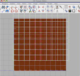 I didn't see the point of importing the whole table model because this shot is going to be a close up. Importing the whole model would just add unnecessary render time. So instead I created a simple plane and planar UV mapped the plane in the Y axis .
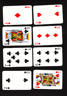 Here are some card images i managed to find on the internet. I shall use some of them in order to create textures.
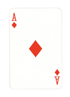 The texture above was prepared in Photoshop CS2. Had to make sure the proportions were correct when modelling the card models so that the texture would actually fit. I didnt want incorrect proportions on the cards otherwise the rest of the proportions would be incorrect. The cards were my point of reference in terms of proportion.
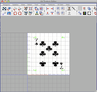 Planar UV mapping the card. Initially this did not work and the UV's were for some reason distorted, but I managed to figure out that I had changed the orient of the UVs to the world. I had to remake them, and reimport them into the scene without changing the orient of the cards themselves. I could the adjust the orient of the cards individually to get that fanned out effect towards the top of the deck.
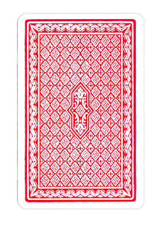 Above is the texture for the back of the cards.
No comments:
Post a Comment