Clock and Calendar Scene Setup
 Clock Frame Texture
 Clock Frame Bump Map
Clock Frame PLaner UV Mapping


Clock Face Texture

Clock Face Planar UV Mapping

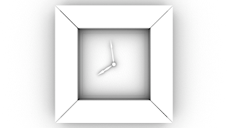
This test render below was a bit of a surprise. At first I had no idea why it looked so awful. The render was blotchy and the clock face was not illuminated enough. I also felt that the clock appeared to be top lit, which is not what I had in mind. Initially thought it was due to the position of the light. This turned out to be the case but also because the samples of the light that I was using were not high enough. I set them from a value of 8 to a value of 55. I also increased the accuracy of the final gather settings from 100 to 155. I thought that these increases in attributes would get rid of the horrible blotch areas in the render. Although this will increase render time somewhat.
 A better render but still not perfect. If anything its too bright now and there are still some blotchy areas. I tweaked some of the settings and reduced the intensity of the light. I also re introduced the lamp shade to the scene in order to create a shadow toward the top of the clock.
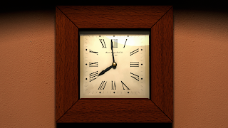
Much better. This is the render I was most happy with. It isn't perfect but I think I can improve this render in Photoshop.

Occlusion Pass
This is the composited version with the final gather and occlusion pass merged together. The occlusion pass tends to make things darker and have more depth. I also duplicated the render image and used overlay to superimpose it over the top, this gave it an agreeable warmer tint to the glass, it also in my opinion provided a more classical mood to the overall image. I thought that the lamp reflection in the glass came out rather well and adds that much needed highlight to the glass.
 Original Storyboard
 I applied the same methods and techniques with this composite as well. These were especially exciting to see how these renders developed and how I made the transition from storyboard/ concept to a 3D shot. I am particularly proud of how these renders and composites turned out. It was doing these composites that I realised how important compositing really is and that a render that is far from perfect can be improved dramatically with some simple compositing techniques. What a difference compositing can make. With compositing unexpected yet effective finishes can be achieved.
Original Storyboard


No comments:
Post a Comment