We started by remodeling the street lamps and Alex was in charge of texturing the scene. I began tweaking the light setup in the scene. We rendered it and still Alex felt something was missing and he suggested we model a neon hotel sign to add a new light source and dimension to the scene to enhance the scene and introduce a little more noir to the render. I thought this was a very interesting idea so I went ahead and created a hotel sign using reference.
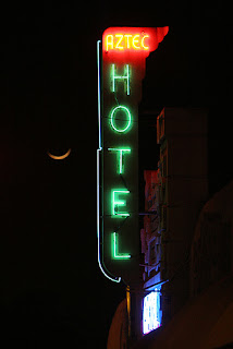
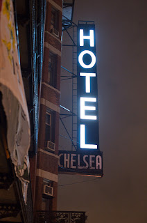
I thought that these images were most appropriate for the time period and mood I was trying to emulate. The Reference image I used the most was the image just above. I was unsure however how to create a glow effect on the neon light itself. Fortunately Digital tutors had a tutorial for creating such effects. There was of course the use of an area light however this would increase render time and when I tested it, the light only illuminated the surroundings and did not provide a glow effect to the actual lettering. The other method was the use of a simple surface shader and applying an outer glow to the shader itself. I carried out a render test and the effect was far more agreeable.
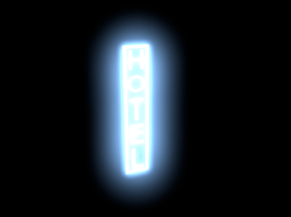 The initial render was creating a nice glow effect, but was only noticeable once the render had finished so we had to be mindful of that when rendering using final gather, which takes far longer. The render above however had too much glow and the lettering was getting lost. So I tried lowering the intensity of the outer glow setting.
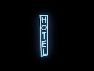
There much better. However perhaps a little more glow is needed here and I may need to get rid of the sign border as it seems to be overpowering the letters.
The renders above were just served as simple lighting tests. I then remodeled the neon light sign to add a little more detail.
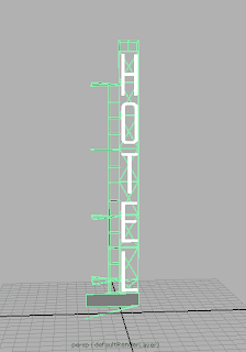
I tried out different colour lights, I firstly tried green but I think blue fits a little bit better with the scene seeing as blue light is coming into the interior scene. We rendered the whole shot again, however Alex still thought something was missing and suggested that a pharmacy light may introduce a little extra to the overall composition. I was again skeptical and was worried the scene was becoming too busy, however when he rendered it it did look very cool. I admit I was wrong and Alex was right when it came to enhancing this shot.
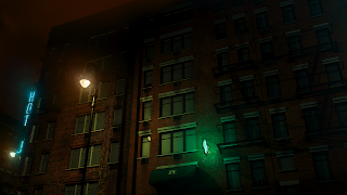
Above is a rendered version of the finished backdrop, with a little post so that the render itself is not so "clean." Render and compositing done by Alex Caldow.


No comments:
Post a Comment