Tuesday, 31 May 2011

Hat Card Miss: Animating

This was tricky to animate as it was difficult to get a believable yet rotational flying path for the thrown card. Alex and I helped each-other to get the animation just right. In fairness it is quite a quick animation but we didn't want it too chaotic. We tried to see how a card would behave when thrown by throwing some real cards we found at home. Their paths were very chaotic, but for theatrical reasons we thought it would be better to animate a more idealistic flight path so that it would not appear jarring to the eye. It took several attempts, the hardest part was to get a believable rotation whilst maintaining the flight path. We had some trouble getting the animation right where the card bounces off he rim of the hat. It was always too slow and unconvincing. It took a lot of tweaking and trail and error. Eventually the animation was coming together. We just needed to speed the animation up a little, so we condensed the key frames in the timeline. It is still a little slow but this can be fixed in after effects. There is a method of speeding up the footage.

Hat Card Miss Scene Setup

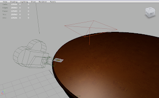
This is the Card Miss scene setup for (shot09) on the original storyboard. This is the scene where Frank attempts to throw the card into the hat but he misses his target due to the fact that he is distracted. For the clip I have decided to have Frank distracted by the parcel that is put through the door as opposedto the photograph he finds of his girlfriend. The image below shows the camera placement and the lighting setup. I wanted a close up for this shot as I thought it would more interesting and it also meant that with this particular camera placement I could have the card fly past the camera.

Lighting this scene was quite tricky and both Alex and I tried to get the lighting looking believable. To begin with we tried experimenting with just one light, however it was always too bright/ overexposed or too dark. So we introduced some extra lights so that we could first light the card, because initially the side that faced the camera was completely black. We also wanted some bounce light on the background as well as under the hat itself. We felt that with the use of only one light the scene would have otherwise been too dark and certain components would have been indistinguishable.


Occlusion Pass
Final Gather Pass

Original Storyboard


Again very pleased with how this shot turned out and how close it is to the original storyboard. However rather than having the camera on Frank's side of the table and having the card move away from the camera I thought it would be more interesting if we had the camera placed on the opposite side of the table so that the card would instead fly towards the camera and the audience/ viewer. This way the composition in my opinion would be far better, the shot would be therefore more dynamic and the detail of the card could be seen more clearly.

Queen of Hearts: Animating


Animating this scene was tricky. It took me a while to get a believable sliding rotation path on the card that I was somewhat happy with. Initially I made the mistake of trying to animate the rotations whilst key framing its trajectory. So I started again and this time focused on the slow in and slow out of the card. To begin with I wanted it to have some momentum, but not too much. The idea is that the previous shots are when Frank deals the card, attempting to get it into the hat(shot08), the card then misses its target (shot09) and then the card loses momentum and slides across the tabletop before coming to a stop at the edge of the table narrowly avoiding falling off the table (shot10). I worked on this part of the animation for some time. I wanted the speed of the card just right. I wanted to get the animation of the card slowing down right also. A lot of the time the card was far too slow or far too fast, bearing in mind that I had little space to play with. Through trail and error I had to animate the card between the right hand side of the frame and the edge of the table towards the left of the frame. To get the card to have some speed and then slow out I needed to space key frames relatively close together along the timeline and then when it came to the slow out I had to key the movement of the card with intervals much wider apart. It had been a while since I had animated anything and I was a bit rusty. I then added in the rotations last along the trajectory. This worked out far better. The animation is still a little slow but I think that if I do anymore to it I may ruin the animation. I will therefore speed up the animation using Adobe After Effects.


The purpose of this shot is symbolic. The queen of hearts represents the love of Frank's life. The irony is that he has been instructed to kill the one he loves. Te fact that the card doesnt slide off the table suggests that Frank will not go through with this terrible deed and that the woman he loves will survive.

Queen of hearts Scene Setup

A very simple scene setup with a standard area light. The colour light output was adjusted to a a warm cream colour. I then changed the light shape in the mental ray tab of the light attribute to a sphere so that I could get the light quality closer to that of a bulb. A regular area light gives a very harsh edge to the shadow whereas I wanted some realistic and softer drop-off. I also switched the area light from no decay to linear. Digital Tutors taught me that when a default light in Maya is created its light output behaves unrealistically as it emits light and its rays strength do not dissipate with distance. However once switched to linear you can achieve some great lighting effects as its strength wanes depending on how far away you place the light from the subject within the scene. With these settings it is possible to light something effectively with put adding more lights to the scene which is unnecessary and impractical as a scene becomes messy and harder to manage. Adding numerous lights can cause scenes to become overexposed and over-lit. Having fewer lights in a scene also reduces render time as Maya does not need to calculate so many rays of light and how they react with the surfaces/ faces/ normals of the geometry within the scene.


To begin with the scene was too overexposed as I had set the intensity far too high to a value of 8.000, I forgot to take into account that the light placement was relatively close to the tabletop geometry so I reduced its value to 4.000. The result was very much improved and the colour of the textures were perfect. Not too bright and not too dark. I then deleted all the components within the scene that were no in shot so as to reduce render time. Having geometry outside the frame is unnecessary and reducing memory never hurts.


Occlusion Layer
Final Gather Pass
Composite

Here I adjusted the brightness and contrast by increasing the contrast.
This is the original storyboard. I am happy that I successfully setup the scene to resemble the original storyboard so closely.

Friday, 27 May 2011

Rendering


We shall be rendering in layer passes. So we will be rendering final gather and occlusion passes separately so that these layers can be easily separated, managed and composited. Some of the longer sequences will take a while due to the fact that we are using high quality textures and rendering in 1080p HD. We will be rendering on our own laptops instead of the render farm, as I have heard it is very unreliable and some frames are jumped. The benefit of rendering on our laptops is that we can render in parallel to eachother. We can also render and still have a computer to work on. We can render with both machines at once to speed up render time. Also, we can monitor how our rendering is going. We will be using batch rendering in order to render animation sequences.

We have to make sure we are rendering in the correct aspect ratio/ format and that we are rendering through the correct camera and that we are rendering in mental ray. We also need to make sure we are rendering out our frames in a .tga format.


I figured that using stills would be firstly would still serve as visual information in order to tell a story and would also be a good way of reducing render time. Why have a fancy camera move if a static camera placement can show the exact same information?

Working with my Brother

Working with my brother has been a good way of working. The reason for this is because we live under the same roof, and we are able to communicate to each-other effectively and we are able to exchange files easily. I can trust my brother to carry out what is needed and his work is always of a high standard. I am not as skilled and as proficient as my brother at Maya, but I have learnt alot from him in as far as techniques. I believe I am improving as a 3D artist as a consequence. The down side is, it is really only two of us and there is alot of work to do. We are proficient in most areas, and are willing to experiment and learn new things. However we are not so skilled in the area in as far as the character, including rigging, blend shapes and painting weights. This has been a challenge to grasp and relying on others who are spread acroos different groups has proved difficult at times. I did not exactly choose to work as a 2 man group, it happened to turn out that way unfortunately. However I did not want to give up and saw it as a challenge and an opportunity to learn new things. So I decided to fight for my idea/ pitch and continue with Patience, regardless.

Tuesday, 24 May 2011

Composites

I have been producing composites in order to firstly composite the still shots and secondly to composite a frame in order to serve as reference for Joe when compositing the animation sequences. This will help him produce composited sequences that will follow the examples I have given him in as far as colour correction, brightness and contrast and vignettes for artistic aesthetics.