 I then adjusted the diffuse, eccentricity and reflectivity so that the reflectivity was not so strong. With these settings I achieved a much better result.
I then applied a mia_material chrome white texture to the bindings, I was unhappy with this result because the bindings seemed way too reflective.

I created a texture in photoshop of a calendar chart. Applying the texture here needed some work. First off I needed to make sure that the calendar chart was not obscured by the ring binding holes. I needed to make the texture bigger in order to compensate for the holes toward the top.

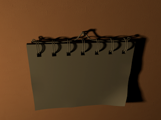 Here is the untextured model of the calendar. I wanted to place it not too far from the clock within the scene. I positioned it so that it was illuminated enough and some nice shadows were created.
Next I then decided to include the calendar to the same Maya scene so that both models would be subject to the correct lighting levels.
 Here is a close-up image of the applied sharpened texture. The texture looks far more crisp and the undesirable blurring of the design has been eradicated.
 I then applied the clock face texture. I was pleased with the result, however I noticed that the texture seemed a little blurred. I then realised that I had forgot to sharpen the texture in Photoshop which helps to render the texture more crisp at the edges.
 Here is the design of the clock face which I created myself using Photoshop. I made sure the ratio of the texture for hight and width were identical. I used the ration 1024:1024 so as to prevent the texture from being deformed or stretched. This way the texture is guaranteed to fit upon the clock face plane.
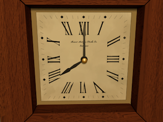 Initially there were weird stretch marks caused at the corners of the wood framework. For some reason these stretches were only visible when rendered. (Stretching of the texture can be seen at the bottom left and right of the image above). It may have been caused by the fact that I was texturing using smooth preview. I discovered that adding extra resolution to the model solved this problem.
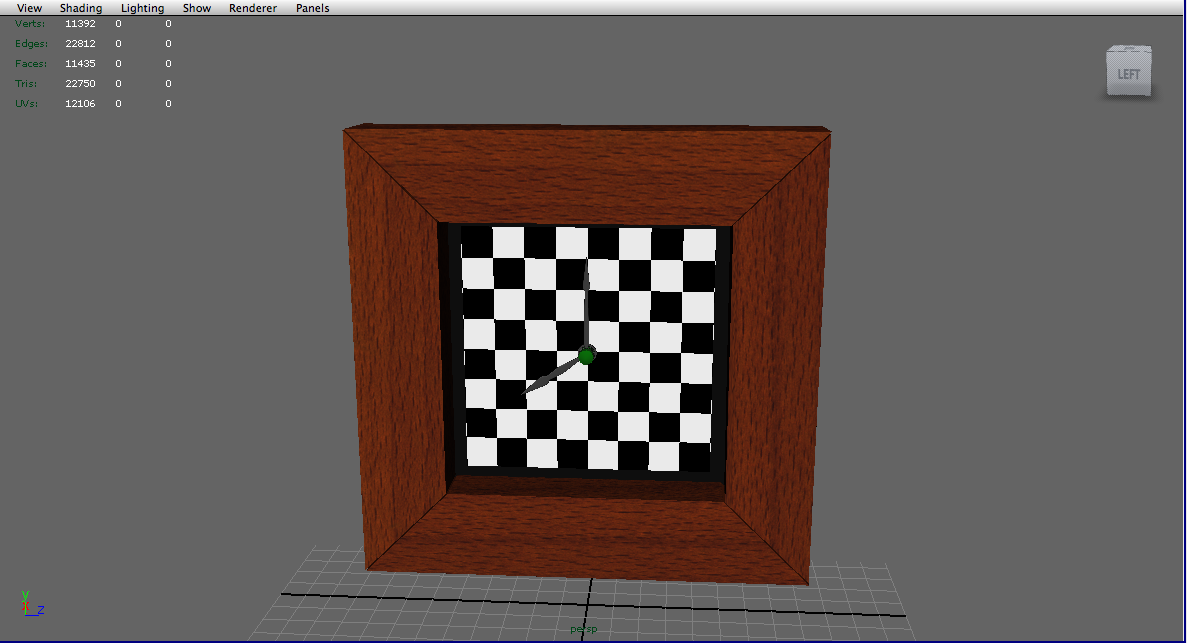 I then carried out the same principle with the clock face.
 I began texturing the clock by applying a wood texture to the frame. I first applied a simple checkered texture to the framework so that I could clearly see where the wood texture would stretch. I then planar mapped each face that was visible to the camera according to the axis which they were aligned to. I then used the UV texture editor in order to edit the size of the checkered squares so that they were no longer stretched and formed perfect squares. I also made sure that the squares were decreased in size so as to improve detail and resolution. Once all the faces were UV mapped I then applied the wood finish. I used a blinn shader in order to achieve a small amount of reflection. I then applied a grayscale and slightly more contrasted version of the same wood texture to the blinn as a bump map so that an illusion of depth is achieved to the wood grain.
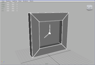
Here is the initial clock model. It is a very simple model which consist of very few components. The framework consists of different pieces so as to easily achieve slight irregularity and the seams between the woodwork. I applied a subdivision approximation via mental ray in order to achieve a smoothed preview render that would decrease render time.
Thanks for taking the time to discuss this, I feel strongly about it and love learning more on this topic. video production norwich
ReplyDelete