Wednesday, 15 December 2010

Clock & Calendar


I then adjusted the diffuse, eccentricity and reflectivity so that the reflectivity was not so strong. With these settings I achieved a much better result.

I then applied a mia_material chrome white texture to the bindings, I was unhappy with this result because the bindings seemed way too reflective.

I created a texture in photoshop of a calendar chart. Applying the texture here needed some work. First off I needed to make sure that the calendar chart was not obscured by the ring binding holes. I needed to make the texture bigger in order to compensate for the holes toward the top.

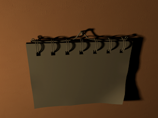
Here is the untextured model of the calendar. I wanted to place it not too far from the clock within the scene. I positioned it so that it was illuminated enough and some nice shadows were created.

Next I then decided to include the calendar to the same Maya scene so that both models would be subject to the correct lighting levels.


Here is a close-up image of the applied sharpened texture. The texture looks far more crisp and the undesirable blurring of the design has been eradicated.

I then applied the clock face texture. I was pleased with the result, however I noticed that the texture seemed a little blurred. I then realised that I had forgot to sharpen the texture in Photoshop which helps to render the texture more crisp at the edges.

Here is the design of the clock face which I created myself using Photoshop. I made sure the ratio of the texture for hight and width were identical. I used the ration 1024:1024 so as to prevent the texture from being deformed or stretched. This way the texture is guaranteed to fit upon the clock face plane.
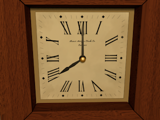
Initially there were weird stretch marks caused at the corners of the wood framework. For some reason these stretches were only visible when rendered. (Stretching of the texture can be seen at the bottom left and right of the image above). It may have been caused by the fact that I was texturing using smooth preview. I discovered that adding extra resolution to the model solved this problem.
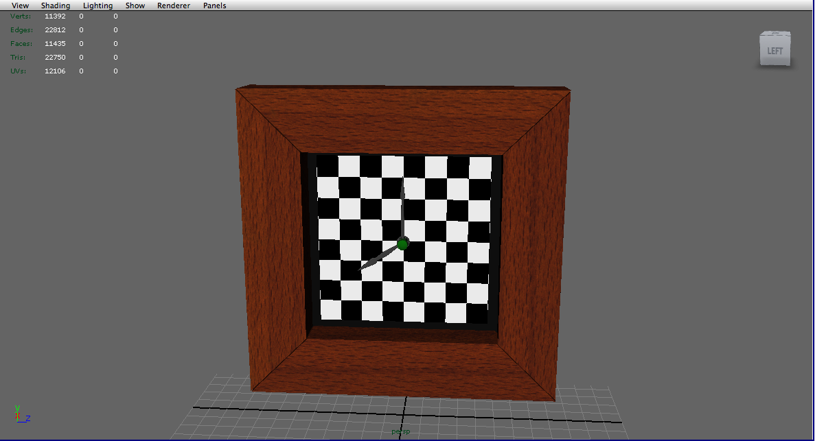
I then carried out the same principle with the clock face.

I began texturing the clock by applying a wood texture to the frame. I first applied a simple checkered texture to the framework so that I could clearly see where the wood texture would stretch. I then planar mapped each face that was visible to the camera according to the axis which they were aligned to. I then used the UV texture editor in order to edit the size of the checkered squares so that they were no longer stretched and formed perfect squares. I also made sure that the squares were decreased in size so as to improve detail and resolution. Once all the faces were UV mapped I then applied the wood finish. I used a blinn shader in order to achieve a small amount of reflection. I then applied a grayscale and slightly more contrasted version of the same wood texture to the blinn as a bump map so that an illusion of depth is achieved to the wood grain.
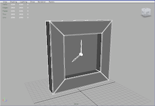
Here is the initial clock model. It is a very simple model which consist of very few components. The framework consists of different pieces so as to easily achieve slight irregularity and the seams between the woodwork. I applied a subdivision approximation via mental ray in order to achieve a smoothed preview render that would decrease render time.

Saturday, 11 December 2010

Critical Analysis

We are on schedule in this project however since there is only two of us at the moment working on this project I am concerned that we may not be able to finish this animation short as there is still a lot to do and to learn. The next big task is to model, UV map and texture the character Frank.

I am very pleased with the progress I am making in the 3D side of things. I have learnt a lot and improved in both lighting and texturing in Maya, thanks to digital tutors. I am also pleased with the standard of my work. I believe that I am producing some high quality work that I can include in my portfolio. I am pleased with my time management skills so far, seeing as we have pretty much completed the tasks I set for this term and we seem to be on schedule.

Friday, 10 December 2010

Formative Assessment

Overall the presentation went very well and was well received by students and tutors. The tutors did recommend that I introduce some sort of resolution to the ending to give the animation more impact so that the audience doesn't feel disappointed or cheated.

The tutors did say however that we have made good progress and that some of the visuals should look stunning. They seemed to be impressed with the work that has been done particularly with the mood and design of the apartment interior. I believe that my brother and I presented well as the tutors and the students seemed to understand what we are attempting to convey and we received some positive feedback.

Animatic


I was very pleased with the anamatic and how it brought the storyboard to life particularly with the addition of sound. I believe that I did a good job on the sound especiallly since it was only rough foley to suggest what sort of sounds I am looking for and what mood I am attempting to get across to the viewer. It was well received by students and tutors. I feel however that the pacing was a little too fast for the mood that had been set. I believe that some shots could have been longer in terms of duration.


Wednesday, 24 November 2010

Planar & UV Mapping


The images below show the progression and development of my learning when UV Mapping a 3D scene. I have never UV Mapped before so this method is still quite basic. I have used a couple of online tutorials from digital tutors in order acquire a better understanding of the way UV Mapping works. This scene consists of a vinyl record player which will feature as one of the first establishing close up shots of my animation short.

UV Mapping is necessary as it is a method of creating a map for the textures, so that they can behave correctly on a 3D model.

The image above looks a lot better. The light levels seem more in keeping with the lighting of the apartment interior. I believe the desired mood of the shot has been achieved here.

Above is a finished composite. It is clear in this image that the textures are no longer stretched and look is believable and effective. I am very pleased with this. It looks realistic and the detail of the textures are clearly visible. I have applied a bump map to enhance the textures so that the details react to the light in the scene. This scene however may be a little too overexposed. This image may need to be darkened which I believe can be achieved using compositing techniques such as using multiply and overlay layers and altering the brightness and contrast.The addition of the incandescent plane really enhances the record grooves by interacting with the bump map. This is a composite both of the same scene with and without the incandescent plane, so that it was easier to remove the unwanted reflections. I then overlaid an occlusion pass over the top to introduce more depth to the image.

Here I have decreased the value of the bump intensity from 1.000 to 0.091. This looks much better. The grooves have been toned down and softened so they are a little more subtle. I do think however that an incandescent plane may help to enhance the bump.

The image above demonstrates how I was experimenting with the bump map. The bump map here has produced very deep chasms. The bump intensity was set to default. I shall have to decrease the amount because the detail here is far too pronounced, undesirably and distracting.

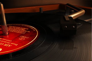
With smooth preview switched on this really does look great. I am very pleased with this. The mia material is providing a very nice chrome texture. I am not entirely sure about the incandescent plane however. It seems to be overexposing the shot and the bright reflection on the chrome arm and needle head is not something I want. I may have to render the same shot with and without the incandescent plane serving as the reflection so that using adobe after effects I can merge the footage together and deleting the area I do not want illuminated.

In this image I applied a mia_material with its presets set to chrome and a blend of 75%. I have seen that these mia textures/ shaders can be really useful and look very effective. The mia material has already enhanced the image here due to its realistic and believable reflections. At the moment the scene has not been switched to smooth preview. Smooth preview can be applied by enabling mental ray and then going to window> rendering editors>mental ray>approximation editor>subdivision>assign.

Above is where I used a highly reflective blinn for all the metallic components. As you can see this material was not suitable. It is too flat and the texture is too uniform.

Above is the bump map which will be applied to the texture below. I learnt that that decreasing saturation so that you end up with a black and white image works best with bump maps. I adjusted the contrast by increasing it even more so that the wood grain is more defined so that the texture will react to the light in the scene. The wood grain should produce some nice highlights to an otherwise flat texture. Bump Maps provide depth to a texture.

Above is a high resolution 1024 x 1024 texture I created using different wood texture images and merging them together using Photoshop. I sharpened the image and increased the contrast slightly so that the texture is enhanced thus giving more definition to the wood grain and the texture as a whole.
The image above shows the model and lighting setup. I made sure that anything behind the camera was not UVed as there is little point. Any parts of the model which was not visible within the resolution gate I deleted in order to decrease render time.

Once the basic method is complete I then planar mapped the record model so that I could project a record texture onto the faces that are facing upward.

Above is the vinyl record bump map. The contrast has been increased here so that the overall detail is slightly enhanced so that the bump map itself will have more definition.

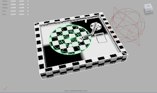
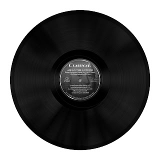
Above is the vinyl record texture. This was a texture I made using various photographs of vinyl records on the internet.

Above is the UV editor which I used to complete the UV mapping process so that the textures look even better. This graph shows the layout of the UVs. This graph can be used to edit the size and look of the applied textures. The UV's must be edited within the top right of the graph.

I have applied a checkered texture to all the components as a temporary test in order to locate any texture stretches. In this image I had to make sure that the checkered texture was not stretched by using the scale tool in the UV editor so that the checkered pattern formed perfect squares. By this useful technique I can use this temporary texture as an indication to show me where the texture is stretching.

The render above is a low resolution test which demonstrates how the textures are behaving when the model is rendered.

The image above shows how I have applied a wood texture to the vinyl record player frame as well as a texture to the record model itself. This texture stretching is the result of not UV Mapping the model so the computer does not yet understand how I wish the textures to behave upon the surfaces.

Above is the vinyl record player with smooth preview turned on. This setting can be useful when rendering as it decreases render time due to the fact that it smoothes models using less polygons, edges and vertices.

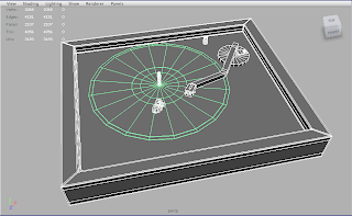
Above is an image of the low resolution vinyl record player model.

Online Tutorials


I have decided to purchase a monthly subscription to an online tutorial website. It is called Digital Tutors. It covers many different techniques regarding a variety of software. It is a very useful and intuitive learning resource. It does cost a bit of money, however it is in my opinion worth it, because I have already learnt so much in a short amount of time. I have been focusing on learning lighting techniques using the 3D package Maya.


Advice & Pointers

David Bull came in today to provide advice, suggestions and additional story ideas to those who were directing their own animation shorts. He came to me and seemed very pleased with the progress I had made and thought that the idea I had was different and mature. He did say that my piece was ambitious as I have to get across the character's (Frank's) ordeal through acting and animation. His comments were both helpful and encouraging. He gave me a few suggestions in terms of shot and story ideas. He suggested that I begin and end with the exterior of the apartment block. The first shot can be used as an establishing shot and the final shot depicts a sudden flash from within the room along with a muffled gunshot, suggesting that Frank commits suicide. He also suggests that I have a shot of a photograph with Frank and Rachel as a couple to strengthen the link between them for the viewer's benefit so that their relationship is slightly more obvious.